The Value of Value

I saw this cartoon online this week and you might call it a lightbulb moment! (Pun intended). I wish I could share the cartoon, but the site does not allow it (without a steep monetary compensation). Do click the link!
(Spoiler note for those that don’t want to click… the caption is “notice how the artist uses light to draw in the viewer” and involves fireflies in a gallery).
Seriously, the light in a tapestry is what I constantly seek in my own work. I love texture and movement, but color and value is really what gets me going. It’s what makes or breaks a piece.
We know that a good - “simple” - rule of thumb is to include 3 different values in a piece.
Light, medium, and dark.
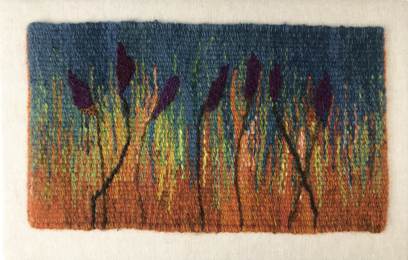
Prairie Colors
When I started Prairie Colors, I was playing with yarn ends from previous weavings. I didn’t check the values first; I just started weaving. But about an inch into it, I thought “wait a minute. I need some light.” I wanted a glow to come through the middle band. So I got out my grayscale tools and searched for colors that trigger the glow factor.
Because it’s such a struggle (and not to mention time-consuming) every time I design a piece to make sure I pay attention to value and get some light in there, I usually turn to color aids like my phone and the filter in the camera. But I want an easy button; something more immediate than searching for my phone and playing with the filters every time.
This got me thinking…

Color Workshop with Laura Bryant from Prism yarns
Years ago, I attended a color workshop at a Stitches event led by Laura Bryant from Prism yarns and I will never forget our first experiment. She had a bag full of beautiful yarns to choose from and spread them all out on the table. Our job was to arrange them from light to dark.
You would think that would be easy.
Light, medium, dark… right?
Simple… right?
It was hard!
I believe there are people that can see color in a very different way than I do - and they have the ability to really hone in on the values. The values just pop for them. But not I. (Over the years, I’ve even wondered if I might be a bit color-blind in some of the spectrum. Particularly yellow-greens. I see them as yellow when others see them as green; this has happened enough over years to cause me to question it).
When I purchase weft yarns, I tend to go deep into the color range. I admit, I’m a bit obsessive about this; I eventually purchase every color. It takes me a while to build up my inventory but when I do, I really know that yarn; something very important to me.
Two yarns I’ve been using almost exclusively are Borg’s Faro and Mora. I love Faro for the more saturated colors and that rustic almost hand-spun look and Mora because it’s finer (20/2) and smoother and gives me a completely different range of colors. I’ve also recently added EPiC yarns to my mix. I suspect EPiC has a bit of both these qualities, and am looking forward to getting to know this yarn better.
So… I’ve been working on a series of color studies that will give me an at-a-glance reference on value for each of these yarns. I’ve already written about the Mora color-blending study underway. Now I have another plan.
I have both the sample pack and the designer pack from EPiC (all 114 colors) and I intend to slowly create a color study going from light to dark on each color.
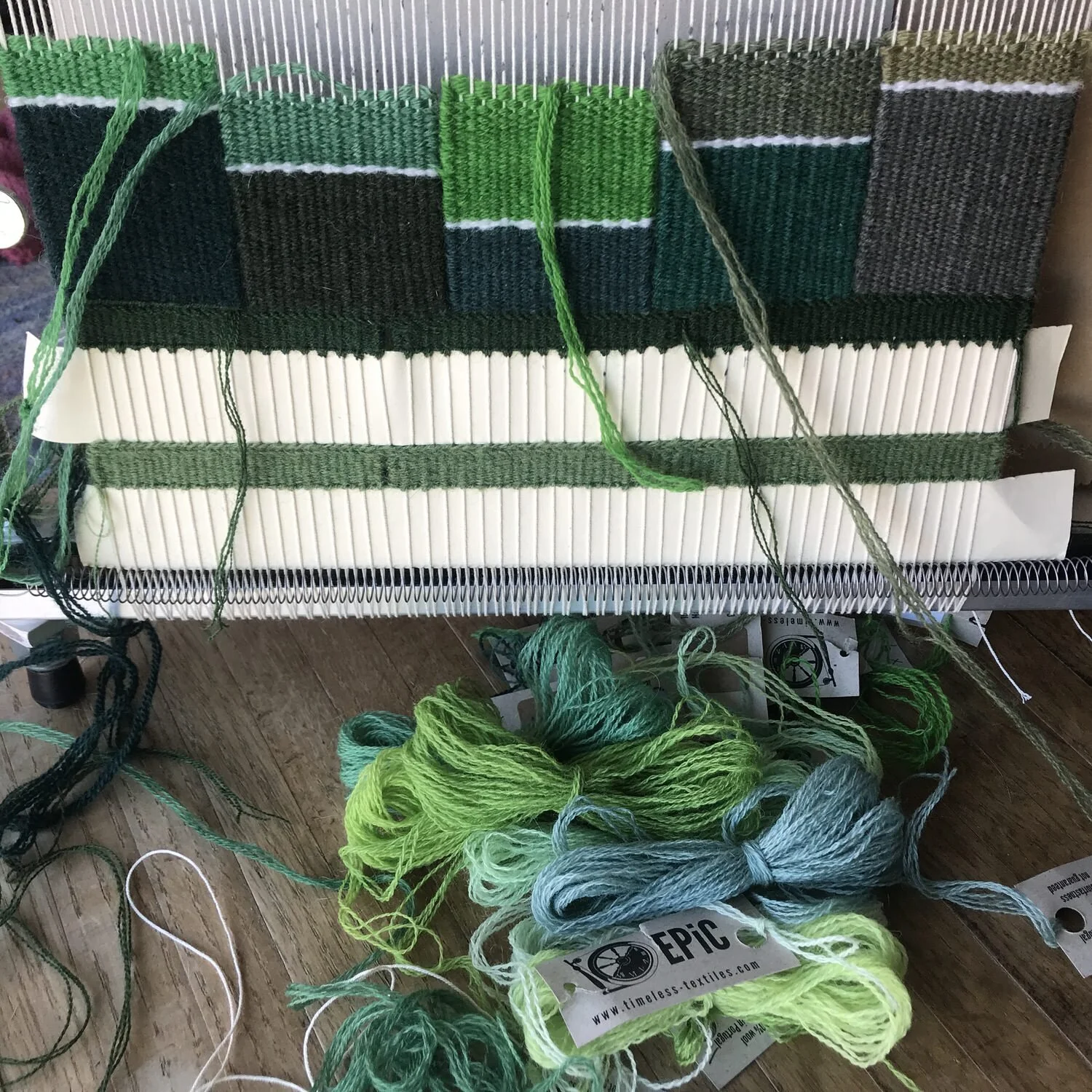
EPiC greens Value Study
Above is a photo of my start on this project. I should add that I’m considering starting over and doing strips in length going from light to dark instead of light to dark in blocks over the width. Should be easier for my brain to process!
When I finish with this “study”, I should be able to look at my sample(s) and quickly choose my light, medium, and dark values!
At least that’s the plan…

All EPiC colors light to dark
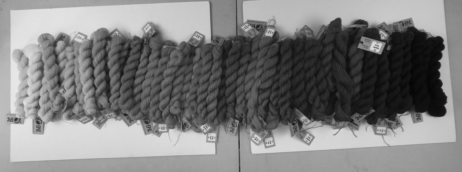
All EPiC in grayscale- with possibly a couple out of sequence…
Or better yet, now that I’ve arranged the entire 114 colors from light to dark- might that not be better than focusing on one color at a time? Hmmm… maybe I need two color studies…
How about you?
Got a favorite method for choosing your colors?
Please share!